


I’m continuing the tradition of compiling the best charts for the past year. 2022 was full of important events and new records so instead of the 5 best charts, I’m presenting 10 ones this year.
Inflation Peak
Inflation was one of the key stories in 2022. Since the beginning of the pandemic, it consistently surprised to the upside, forcing central bankers to keep revising inflation projections up. It ended in October 2022 when the Bank of Canada performed the first downward revision of the inflation trajectory.
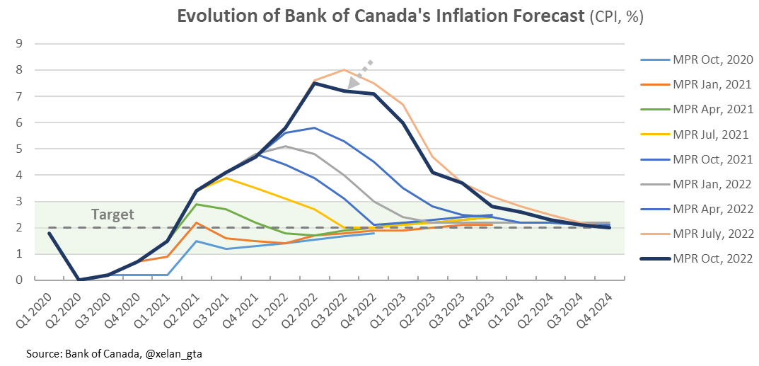
2022 was likely the peak of the post-pandemic inflation wave.
Largest and Fastest Interest Rates Increase
Despite the run-up in inflation well above the 2% target Bank of Canada only started responding to it in 2022 by raising interest rates. Further upside surprises and also broadening of the inflationary pressures forced the central bank to play catch-up and perform tightening at an unprecedented speed and scale. The policy rate went up by 4% (from 0.25% to 4.25%) within a year. Also due to much higher debt levels compared to the past, that cumulative increase would’ve felt as nearly 8% by the households in 1990.

After adjustment for debt levels interest rate tightening cycle in 2022 was the fastest and also the biggest since at least 1994.
Steepest Yield Curve Inversion
Not only the current interest rates tightening cycle is the fastest and biggest it’s also the most restrictive since at least 1991. When central banks are raising interest rates, they usually try to stop at the “sweet spot” called the neutral rate, where they believe the economy can function sustainably without cooling down or overheating.
It’s not the case today. Due to the nature and scale of inflationary pressures Bank of Canada is intentionally raising rates above the neutral rate into the restrictive zone to cool down the economy. When inflationary pressures sufficiently recede they are planning to lower the rates back to the neutral rate, which is currently estimated to be somewhere between 2% and 3%.
The bond market shows how restrictive the policy is when comparing longer-term bond yields to shorter-term ones. 10-year and 2-year is one of the most commonly used pairs which is presented here.
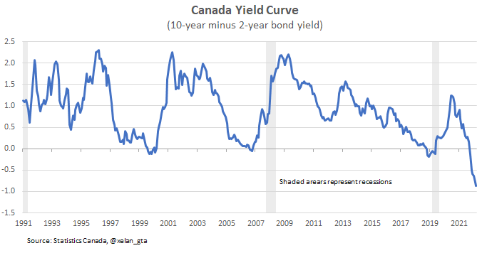
When yields for shorter durations are higher than those for longer ones it’s called a yield curve inversion (more explanation) and corresponds to the negative readings on the chart. The latest inversion happened in July 2022.
It’s not uncommon for regular tightening cycles to precede(cause) recessions so yield curve inversion is an important indicator of recession risk. In the US, every single one of the six yield curve inversions since 1976 was followed by a recession within 2 years. It inverted in 2022 for the seventh time.
Lowest Unemployment on Record
The most restrictive tightening cycle is supported by a healthy economy and a set of very strong macroeconomic indicators. One of those indicators is Canada’s unemployment rate which was the lowest in 2022 since at least 1976.

The labour market recovery after the pandemic was remarkable.
The Peak of Household Wealth Relative to GDP
Household wealth relative to GDP was rising steadily since at least 1990. It experienced a significant increase at the beginning of the pandemic which is a result of declining GDP and pandemic-related financial support programs. More interestingly it sharply declined in 2022 below the long-term trend as a result of declining valuations in many asset classes.

The key question here is what should this trend look like fundamentally. Is it sustainable for household wealth to rise faster than GDP? Interest rates were steadily declining since 1990 boosting valuations of asset classes which could be one of the key reasons explaining the uptrend on the chart observed over the last 30 years. Interest rates dropped to 0.25% - the effective lower bound in 2020 ending this tailwind for assets valuations. If that link is correct and its impact is significant enough then the 2022 peak could mark an important inflection point in history where household wealth as a percentage of GDP may not sustainably exceed it for a very long time.
Record Population Growth in Canada
Canada’s population growth skyrocketed in 2022 setting a new record high since at least 1973. Strong growth in immigration, non-permanent residents, and asylum claimants were the main drivers.

Largest Population Outflow from Toronto
Canada’s record population growth in 2022 didn’t look equally impressive for Toronto Metro due to the rising outflows both within the province (Intraprovincial) and also to other provinces (Interprovincial). Those combined outflows reached a record level since at least 2002.

Housing affordability challenges are considered to be the primary reason behind this trend therefore outflows should continue while housing remains unaffordable.
Housing Correction in Toronto?
News about the Toronto Metro housing correction dominated local headlines in 2022, however, if we zoom out to less-frequency yearly data this correction is completely unnoticeable. The average price in 2022 was 9% higher compared to 2021 one(link). At the same time mortgage rate increases negatively impacted housing affordability. Attainable price, which is calculated based on housing affordability declined to nearly 50% below the actual average price.

This chart was presented in the top 5 charts last year(link) and it absolutely deserves its spot in 2022 as well. The gap between average and attainable prices is the biggest since at least 1982 both on an absolute and relative basis.
Note: The methodology selected here for attainable price calculation is used by major economic researchers, including the IMF (link)
Unattractive Condo Investment Returns
A traditional metric of Real Estate investment returns is cap rate which is calculated as annual net rental income divided by property purchase price. It can be compared to the returns of other asset classes in order to determine which investment is more attractive. 2022 was the first year since at least 2003 when bond yields exceeded estimated Toronto Metro condo cap rates.

Real Estate investment is riskier compared to bonds and normally riskier investments should provide higher returns. Despite strong growth in rents and a decline in prices, Toronto condos in 2022 became the most unattractive for investors since at least 2003 based on that metric.
A Downturn in Global Real Estate Markets
Many macro trends discussed previously have global nature: inflation, interest rate tightening cycle, labour market, and household wealth. There are global real estate cycles as well and globally year-over-year real estate price growth peaked in the last quarter of 2021 and started declining at the beginning of 2022.

Is it a coincidence that Toronto Metro real estate prices peaked around the same time? While local fundamentals such as immigration and construction are important, Toronto Metro real estate market is just a small part of a bigger ecosystem and sometimes there are much stronger forces at play that shape real estate cycles globally. 2022 marked the beginning of another global downturn in Real Estate prices and it’s unclear at the moment when and where it’s going to bottom.