

Is 2021 Toronto Metro Real Estate Market Stronger Than 2017 One?
Is 2021 Toronto Metro Real Estate Market Stronger Than 2017 One?
[Membership Content Sample] Comparison of those two periods from the Real Estate statistics point of view.


Recently a lot of analysts are extensively covering Canadian National Real Estate statistics or even provincial ones. Here is the example of the Twitter post by a great housing analyst Ben Rabidoux from North Cove Advisors.

While there is no doubt the national Real Estate market is currently much stronger than it was in 2017 (record tight using some metrics) I see a potential danger here because people may project those insights directly onto the market where they live, for example, Toronto Metro.
So let’s stop for a second, leave national and provincial markets aside, and focus just on the Toronto Metro Real Estate market.
Is Toronto Metro stronger today than it was in 2017?
Let’s find out.
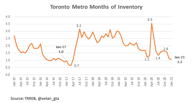
I’ll start by presenting the same statistics Ben highlighted for Ontario but at the Toronto Metro level. Months of Inventory1 is a little higher in 2021 compared to 2017 (1.1 vs 1.0)
Active inventory is also higher today than it was in 2017 (7,396 vs 5,034).

Based on those two metrics Toronto Metro Real Estate market is not stronger today than it was back in 2017 but it’s definitely strong historically.
Other Statistics
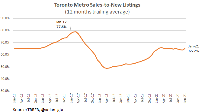
Even though a classic market balance indicator Month of Inventory is suggesting we are very close to 2017 another classic market balance indicator Sales-to-New Listings2 is telling that the Toronto Metro Real Estate market is nowhere near as hot as it was back in 2017.
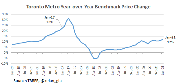
Toronto Metro Benchmark Price (the price of a typical home as reported by Toronto Regional Real Estate Board) is also growing much slower now than it did in 2017 and the growth slope is more gradual as well.
More than half (14%) of 23% price growth in 2017 was not explained by fundamentals such as mortgage rates and incomes pointing to possible froth in the market.
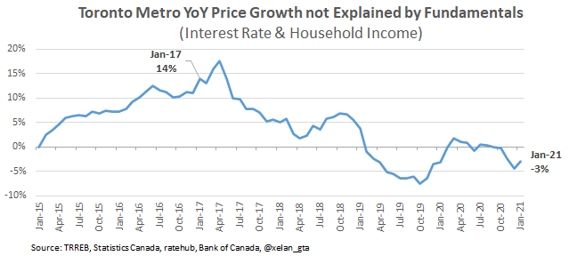
Today all of 12% price growth (and even 15% based on -3% value) is explained by those fundamentals. And that’s using 2% year-over-year income growth for 2020 instead of the real one which is 8.2% for Ontario (Nov. 2020). Weekly earnings were temporarily boosted by the government transfers that’s why 2% is used instead.
If 8.2% income growth would’ve been used then fundamentals could’ve explained up to 21% Year-over-Year increase in Toronto Metro benchmark price.
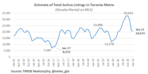
Additionally, if we expand active inventory and include rental units, the picture becomes completely different with record inventory for the month of January at least since 2012.
Summary
To answer the question - no, the Toronto Metro market is not stronger today than it was back in 2017 however the perspective and conclusions may change depending on which segment you are looking at. It’s very possible if we carve out just 905 single-family homes they will end up stronger today than they were in 2017.
The purpose of this post is to warn about the dangers of extrapolating conclusions based on proxy data. Always look at the data which is the most relevant to you and it will help to form a much more accurate view.
Again, I’m not suggesting that Toronto Metro resale market is not strong, it is quite strong historically, but so far all that strength is explained by the fundamentals unlike 2017. It’s easy to lose focus among those “Record High” statistics and media headlines.
Months of Inventory shows how many months are required to absorb current active inventory at a current level of monthly sales. The lower the value, the stronger the market.
Sales-to-New Listings measures market balance by comparing the number of sales within the last month to the number of new listings during the same period. The higher the value, the stronger the market.