


A Novel Approach to Housing Affordability
A special article dedicated to the topic of housing affordability and development of a new metric aimed at addressing the shortcomings of existing ones.


Highlights
If you are short on time, the novel approach presented here involves calculating the cumulative housing affordability metric over the entire duration of the mortgage amortization. This differs from current mainstream metrics, which calculate it as a point-in-time value at the time of property purchase. The new metric has its advantages and drawbacks, which are discussed in this article.
Housing Affordability
Housing affordability is an intuitively clear concept, but quantifying it is challenging. There are several different metrics to measure it, and there is no consensus on which one is the best. Unfortunately, despite the variety, all mainstream metrics still have significant flaws. Therefore, I have developed a new metric aimed at addressing existing shortcomings. I will begin by providing an overview of traditional metrics, along with an analysis of their strengths and weaknesses. If you are already familiar with these, you may want to skip this part.
Price-To-Income Ratio (Median Multiple)
One of the traditional housing affordability metrics measures the ratio of house prices to household incomes. The higher the ratio, the more unaffordable the market is. Demographia is one of the key data providers adopting this approach.

This data is cited by other companies such as Statista,
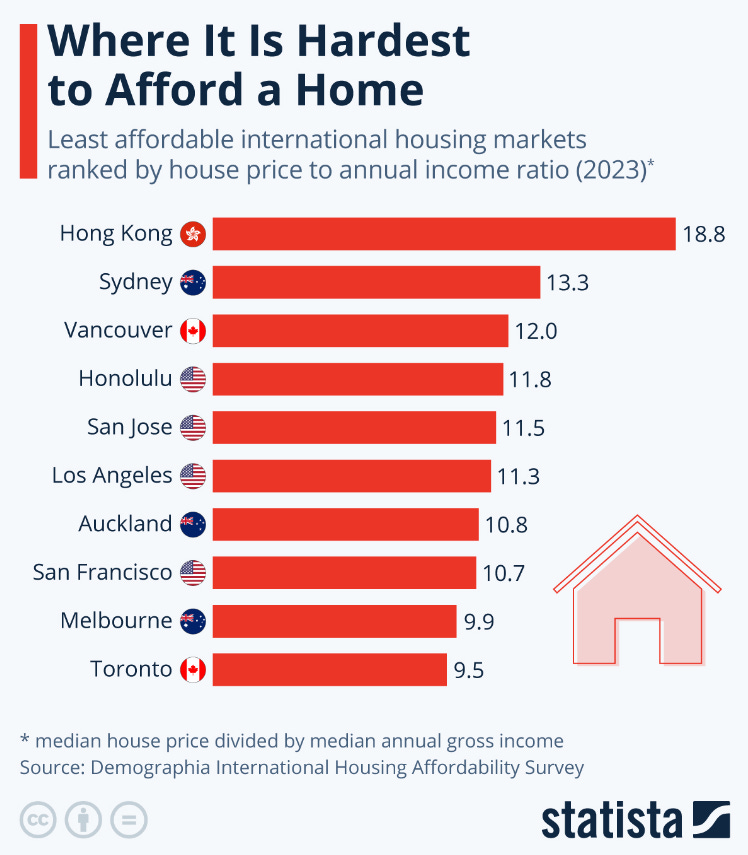
Visual Capitalist, and others.

While this metric works well in stable mortgage rate environments or for cash purchases, it is less effective when properties are purchased with mortgages in environments where mortgage rates change. A variation of the price-to-income ratio, the price-to-rent ratio, faces similar challenges due to the strong correlation between incomes and rent prices.
Here is an example to demonstrate the shortcomings of the price-to-income metric. Two scenarios are presented: A and B, with two key differences. In scenario A, the property purchase price is $900,000, while in scenario B, it is $1,000,000. The second difference is that mortgage rates in scenario A are 10%, while in scenario B, they are 4%.
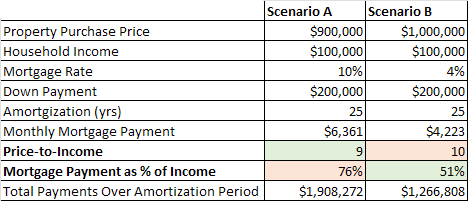
If we focus on the price-to-income metric, the market in scenario A is considered more affordable since the value is 9, compared to 10 in scenario B. However, if these properties were purchased with a mortgage, the carrying costs would be lower in scenario B, representing 51% of household income compared to 76% in scenario A. From that perspective, the market in scenario B is more affordable since the down payments in both scenarios are identical. Households in scenario B will also spend 34% less over the full amortization period — $1,266,808 compared to $1,908,272 in scenario A.
Price-to-Income / Price-to-Rent Metrics
Pros:
Simple metric with straightforward calculation. Requires 2 input parameters.
Uses actual data without relying on assumptions or forecasts.
Works well for cash purchases.
Cons:
Doesn’t allow comparisons between different interest rate and amortization environments.
Limited accuracy with mortgage purchases.
Measures only point-in-time affordability at the moment of purchase.
Here is what the Price-to-Income metric looks like for Toronto Metro.

It creates a misleading impression that housing affordability in Toronto Metro has gradually deteriorated over the last 40 years, which is a wrong conclusion if changes in mortgage rates are taken into account. The metrics presented below will demonstrate that.
Mortgage Payment as a % of Income (MPPI)
Since most real estate purchases involve mortgages, using monthly carrying costs as a share of income could be a better metric for assessing housing affordability. This metric also allows historical comparisons across different mortgage rate environments. In fact, it is currently a mainstream metric tracked by institutions such as RBC, National Bank, Bank of Canada, and others. This methodology also forms the basis of the housing affordability metric I track personally. Implementations vary based on selected metrics—such as average or median incomes, average, median, or benchmark prices, and fixed, variable, or minimum mortgage rates—but they generally yield similar results. For instance, RBC includes property taxes and utility expenses in mortgage payments to calculate total ownership costs.

The higher the percentage of income spent on homeownership costs, the less affordable the market is. National Bank refers to their version of this metric as MPPI (Mortgage Payment as a % of Income). I’ll use this abbreviation to encompass all methodologies based on calculating mortgage carrying costs as a share of income. Despite its advantages over Price-to-Income, MPPI also has some drawbacks:
Mortgage Payment as a % of Income (MPPI)
Pros:
Relatively simple metric with straightforward calculation. Requires 5 input parameters.
Uses actual data without relying on assumptions or forecasts.
Works well for purchases with mortgages. (an improvement over Price-to-Income)
Allows comparison across different mortgage rate environments. (an improvement over Price-to-Income)
Cons:
Doesn’t allow comparisons across different amortization periods.
Doesn’t account for down payments. (a drawback compared to Price-to-Income)
Measures point-in-time affordability at the moment of purchase.
These downsides are significant because affordability is only measured at the time of purchase and doesn’t account for future changes in incomes or mortgage rates. Given that mortgage terms are typically no longer than 5 years in Canada, housing affordability can vary significantly over the mortgage amortization period due to changes in mortgage rates. Neither Price-to-Income nor MPPI can reflect that.
Attainable Values
Housing affordability based on attainable values is a variation of the MPPI metric, but in this case, the monthly mortgage payment is converted into the baseline purchase price. The National Association of Realtors (NAR) in the USA adopts this approach, using the purchase price based on the maximum mortgage qualification amount as a baseline, which is then compared to the actual real estate prices. If prices exceed the baseline, the market is considered unaffordable, and the ratio falls below 100. (link)

One benefit of this approach is that higher values on the chart represent a more affordable market, which aligns with logical expectations. However, without clarification of the methodology, the index may seem confusing.
Another agency adopting a similar methodology is the International Monetary Fund (IMF). Unlike NAR, they use the historical average for mortgage payments as a share of income(MPPI) to calculate attainable prices for each year. After that, they plot attainable prices alongside actual ones. (link)

The resulting chart is visually appealing and easy to read. It provides an idea of where real estate prices should be based on the selected methodology and visualizes the size of the gap. I love this presentation, so I included similar charts among the best charts of 2021 (link) and 2022 (link).
Conversion from monthly mortgage payments to full purchase prices is straightforward, therefore the pros and cons of this methodology are similar to those of MPPI, described previously.
Novel Approach
To overcome the limitations of traditional metrics and allow better historical comparisons, I developed a new housing affordability metric that measures cumulative affordability over the entire mortgage amortization period. This new metric builds on the Mortgage Payment as a % of Income (MPPI) discussed previously but extends it by measuring affordability every year throughout the amortization period. For each year, corresponding parameters such as mortgage rate and median household income are used. All these measurements are summed together, and a down payment as a share of income at the time of purchase is added. The resulting metric is cumulative affordability, representing the ratio of total expenses over the life of the mortgage to annual household income. It's important to note that 5-year mortgage terms are used throughout the amortization period since those are prevalent in Canada.
The downside of this approach is that to know the actual amount spent on total mortgage payments, one must wait 25 years. To address this, forecasts for input parameters based on market expectations can be used, similar to practices in other valuation methods such as the Internal Rate of Return (IRR).
Here are the results of this methodology. Historically, households have spent about 8 annual incomes on total housing costs, including the down payment, all principal and interest payments.

Assuming future income growth averages 2.5% and mortgage rates stay at 4%, this methodology confirms that the current housing affordability in Toronto Metro is the worst since at least 1980, far exceeding the 1989 peak. While the assumption for income increase may seem low, the real median household income growth over the last 46 years was only 0.2% in Toronto Metro and 0.3% in Ontario and Canada. This remains true for both pre and after-tax income. To account for an upside potential, a value of 0.5% was selected for 2025-2045, which combined with the 2% inflation target resulted in 2.5% annual income growth.
To provide further context, here are examples of affordability calculations for two data points from the previous chart: 1980 and 2021. A typical household that purchased a property in 1980 spent 5.6 times their annual income over 25 years on the down payment and all mortgage costs.
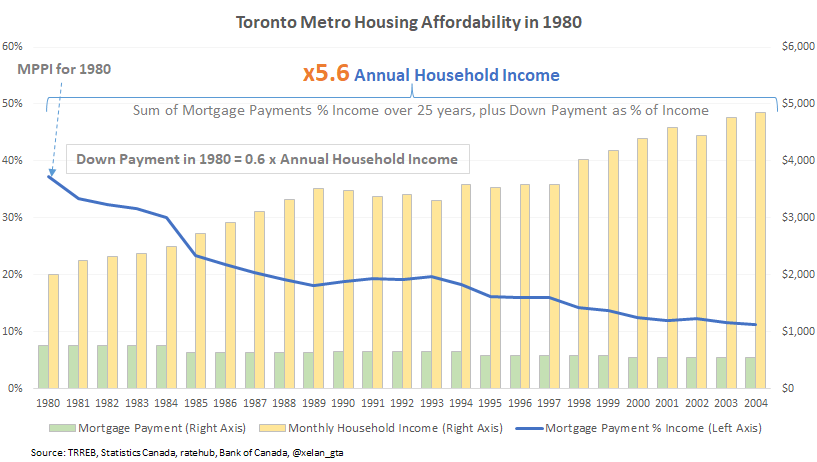
The reading for the first year in these charts corresponds to the MPPI for that year. A typical household that purchased a property in 2021 is expected to spend 13.2 times its annual income on housing costs, assuming a 2.5% annual income growth and a stable 4% mortgage rate from 2025 to 2045.

Even though a 4% mortgage rate is used starting from 2025, the mortgage payment increase occurs only in 2026 because the average mortgage rate of 1.74% in 2021 was locked for a 5-year term.
Here is how this new metric compares to MPPI when tracking changes since 1980. Over the years, cumulative affordability has deteriorated much more than MPPI, suggesting that the housing crisis in Toronto Metro is deeper than perceived.

This is no surprise since those who purchased properties 30-40 years ago paid much smaller down payments as a share of income

and also benefited from persistently declining mortgage rates throughout their amortization periods.

These benefits are not captured by traditional housing affordability metrics but are included in the new methodology. Here are the pros and cons of the new metric:
Cumulative Housing Affordability (Total Costs-to-Household Income)
Pros:
Accurate calculations for purchases made earlier than 25 years ago. (or any other amortization term)
Allows comparisons between environments with different mortgage rates and amortization periods.
Provides a comprehensive picture that includes all costs (including down payment).
Works well for purchases with mortgages.
Correctly evaluates the impact of various policy changes.
Cons:
It is not as straightforward and intuitive and requires advanced calculations and methodology clarification.
Requires at least 6 input parameters.
It relies on forecasts for affordability calculations of purchases made within the last 25 years (or any other specified amortization term).
The new methodology also brings additional benefits, such as allowing comparisons between environments with different amortization periods. Amortization extensions are often used by politicians to address housing affordability challenges. For instance, the recent budget in Canada introduced longer amortization periods for First-Time Homebuyers purchasing new builds, which came into effect on August 1, 2024. (link)

If housing affordability is defined by monthly carrying costs, then amortization extension improves it by reducing those costs. However, this does not account for the fact that it takes longer to pay off the mortgage. Opponents point out that total payments increase with longer amortization periods, leading to housing affordability deterioration.

Here is the modelling done for two scenarios that differ only in the amortization period. It reveals that opposite conclusions can indeed be drawn depending on the selected statistics.

However, the reality is that the impact of increasing the amortization period from 25 to 30 years on cumulative housing affordability is minimal, with a difference of less than 3%.

Amortization increases have other negative consequences that eventually lead to deteriorating housing affordability, but this is beyond the scope of this article. The bottom line is that while amortization extension initially reduces monthly carrying costs, it does not improve cumulative housing affordability.
Alternative Options
Before settling on the methodology presented here, I explored alternative options. One alternative involved taking the traditional MPPI metric and adding the down payment as a percentage of income divided by the amortization period. This adjustment retains the MPPI methodology but at least partially accounts for the down payment. However, the results differed significantly from the cumulative affordability metric, which provides a more accurate measurement.
Another option I explored was simplifying the cumulative affordability metric. Instead of calculating affordability annually, this method involved summing the total costs over the amortization period (for example, 25 years) and then dividing the result by the average household income calculated over the same period. While this approach closely tracked the cumulative affordability metric, it consistently produced lower values throughout the period, underestimating affordability. Overall, I still believe it’s a good alternative with potential.
Conclusions
Valuing various asset classes is a crucial yet challenging task. Creating a perfect metric seems impossible, leading to the development of numerous valuation metrics that highlight different aspects. For example, in the stock market, metrics such as the Price-to-Earnings Ratio, Price-to-Book Ratio, Debt-to-Equity Ratio, Free Cash Flow, and Price/Earnings-to-Growth Ratio are commonly used. For real estate investments, metrics include cap rates, cash-on-cash returns, Internal Rate of Return, and others.
When it comes to valuing real estate for homebuyers, housing affordability metrics are more relevant. These include price-to-income, price-to-rent, and mortgage payment as a percentage of household income. This article has explored the pros and cons of these metrics. Unfortunately, none of them are suitable for comparing different amortization periods and only provide a point-in-time snapshot at the moment of purchase, rather than a comprehensive picture throughout the mortgage amortization period.
To address these shortcomings, I developed a novel housing affordability metric that allows for more accurate historical comparisons. However, it requires data for the full amortization period, meaning accurate calculations can only be performed for purchases made more than 25 years ago. For more recent purchases, estimates of input parameters can be used, similar to practices in other valuation metrics like Internal Rate of Return.
Despite its limitations, this new metric provides a more accurate picture, especially for purchases made over 25 years ago. Housing affordability cannot continuously deteriorate, as mortgage payments cannot exceed 100% of income. Therefore, the historical baseline for housing affordability should not have any upward slope. Establishing the most accurate baseline is crucial for valuation, and I believe this new metric helps achieve that goal. It also reveals that current housing affordability in Toronto Metro is worse compared to the historical average than it is perceived by MPPI. This finding is logical because down payments were a smaller share of income 30-40 years ago, and declining mortgage rates helped existing homebuyers reduce their costs—factors not accounted for by existing metrics.
Lastly, due to the difficulty in accurately measuring housing affordability and comparing it across different time periods, environments, and countries, global rankings widely distributed by the media should be viewed with skepticism.